
![a-windows-control-panel-retrospective-amidst-a-concerning-ux-shift-[hackaday]](https://i0.wp.com/upmytech.com/wp-content/uploads/2024/09/209915-a-windows-control-panel-retrospective-amidst-a-concerning-ux-shift-hackaday-scaled.jpg?resize=800%2C445&ssl=1)
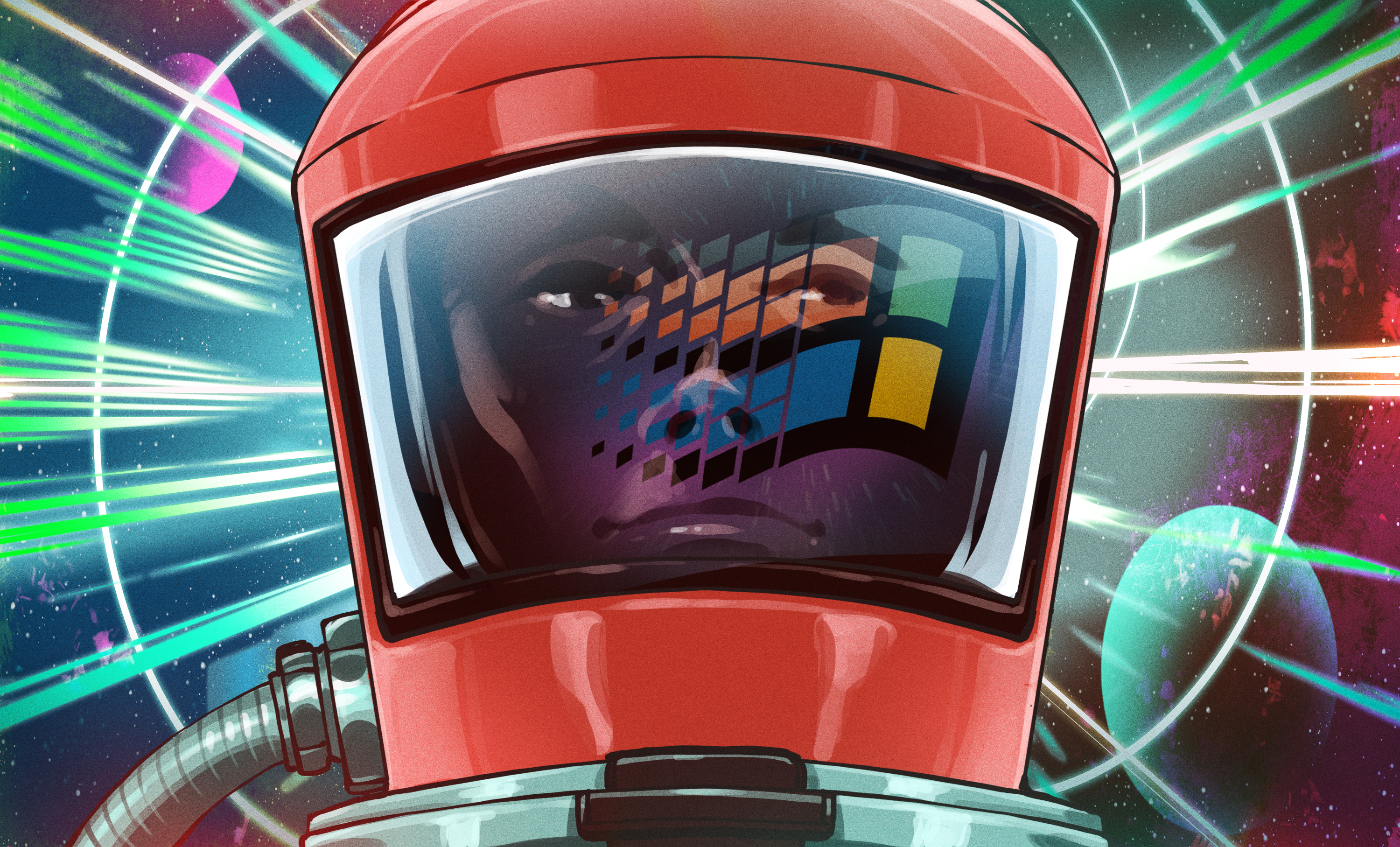
A Windows Control Panel Retrospective Amidst a Concerning UX Shift [Hackaday]
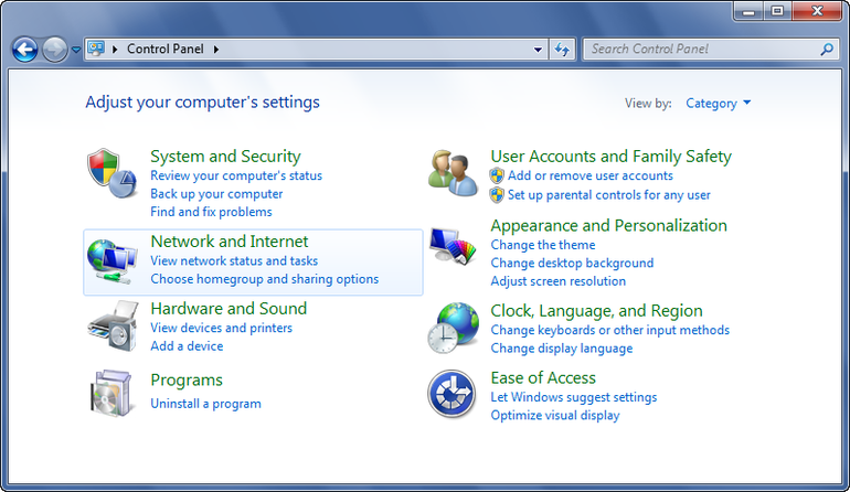
Once the nerve center of Windows operating systems, the Control Panel and its multitude of applets has its roots in the earliest versions of Windows. From here users could use these configuration applets to control and adjust just about anything in a friendly graphical environment. Despite the lack of any significant criticism from users and with many generations having grown up with its familiar dialogs, it has over the past years been gradually phased out by the monolithic Universal Windows Platform (UWP) based Settings app.
Whereas the Windows control panel features an overview of the various applets – each of which uses Win32 GUI elements like tabs to organize settings – the Settings app is more Web-like, with lots of touch-friendly whitespace, a single navigable menu, kilometers of settings to scroll through and absolutely no way to keep more than one view open at the same time.
Unsurprisingly, this change has not been met with a lot of enthusiasm by the average Windows user, and with Microsoft now officially recommending users migrate over to the Settings app, it seems that before long we may have to say farewell to what used to be an intrinsic part of the Windows operating system since its first iterations. Yet bizarrely, much of the Control Panel functionality doesn’t exist yet in the Settings app, and it remain an open question how much of it can be translated into the Settings app user experience (UX) paradigm at all.
Considering how unusual this kind of control panel used to be beyond quaint touch-centric platforms like Android and iOS, what is Microsoft’s goal here? Have discovered a UX secret that has eluded every other OS developer?
A Simple Concept
Settings which a user may want to tweak on their computer system range from hardware devices and networks to the display resolution and wallpaper, so it makes sense to put all of these configuration options within an easy to reach and use location. Generally this has meant something akin to a folder containing various clickable icons and accompanying text which together make clear what settings can be configured by opening it. In addition, the same setting dialogs can be accessed using context-sensitive menus, such as when right-clicking on the desktop.
It’s little wonder that for the longest time operating systems have settled for this approach, as it is intuitive, and individual items can have stylized icons that make it even more obvious what settings can be configured by clicking on it, such a keyboard, a mouse, a display, etc. As graphical fidelity increased, so did the styling of these icons, with MacOS, Windows, BeOS and the various desktop environments for OSs like the Linuxes and BSDs all developing their own highly skeuomorphic styles to make their UIs more intuitive and also more pleasant to look at. A good overview of the Windows Control Panel evolution can be found over at the Version Museum website.
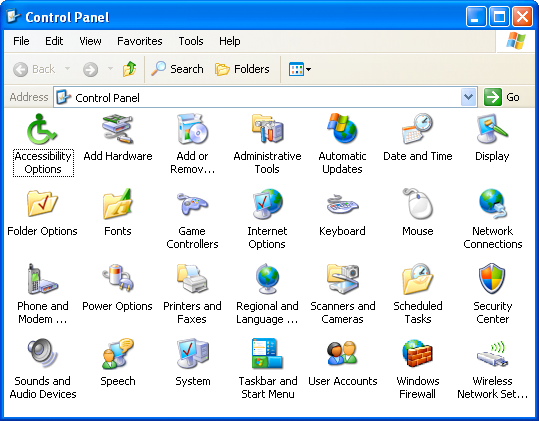
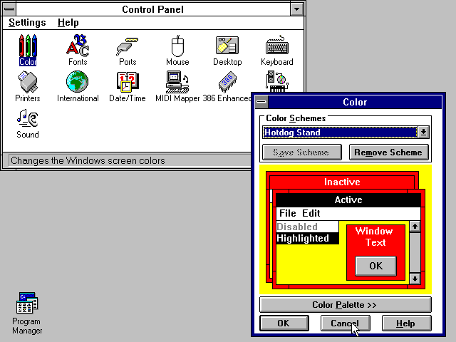
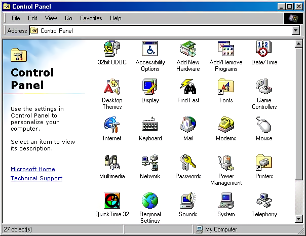
Coming from the still somewhat subdued style of Windows XP after years of Windows 9x and Windows NT/2000, Windows Vista and Windows 7 cranked this style up to eleven with the Windows Aero design language. This meant glass, color, translucency, depth and high-fidelity icons that made the function of the Control Panel’s individual entries more obvious than ever, creating a masterpiece that would be very hard to beat. The user was also given two different ways to view the Control Panel: the simplified category-based view, or the ‘classic’ view with all icons (and folders for e.g. Administrative Tools) visible in one view.
Meanwhile Apple did much the same thing, leaning heavily into their unique design language not only for its desktop, but ultimately also for its mobile offerings. Everything was pseudo-3D, with vivid colors adorning detailed renderings of various physical items and so on, creating a true feast for the eyes when taking in these lush UIs, with efficient access to settings via clearly marked tabs and similar UI elements.
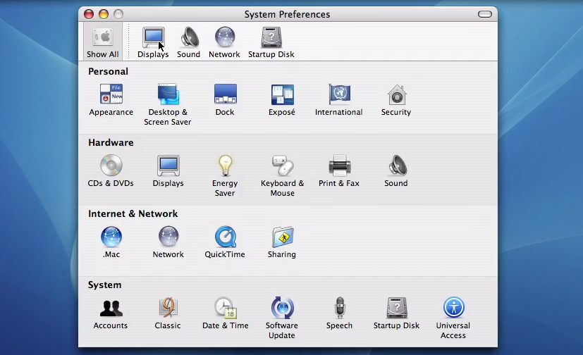
This way of organizing system settings was effectively replicated across a multitude of environments, with operating systems like Haiku (based on BeOS) and ReactOS (re-implementing Windows) retaining those classical elements of the original. A truly cross-platform, mostly intuitive experience was created, and Bliss truly came to the computing world.
Naturally, something so good had no right to keep existing, ergo it had to go.
The World Is Flat
The first to make the big change was Microsoft, with the release of Windows 8 and its Metro design language. This new visual style relied on simple shapes, with little to no adornments or distractions (i.e. more than a single color). Initially Microsoft also reckoned that Windows users wanted every window to be full-screen, and that hot edges and sides rather than a task bar and start menu was the way to go, as every single system running Windows 8 would obviously have a touch screen. Fortunately they did backtrack on this, but their attempt to redesign the Control Panel into something more Metro-like with the Settings app did persist, like an odd growth somewhere on a body part.
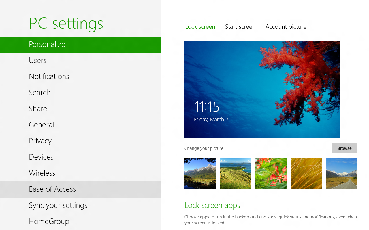
Although the Control Panel remained in Windows 8 as well, the course had been set. Over time this small lump developed into the Settings app in Windows 10, by which time Metro had been renamed into the Microsoft Design Language (MDL), which got a recent tweak in what is now called the Fluent Design Language (FDL) for Windows 11.
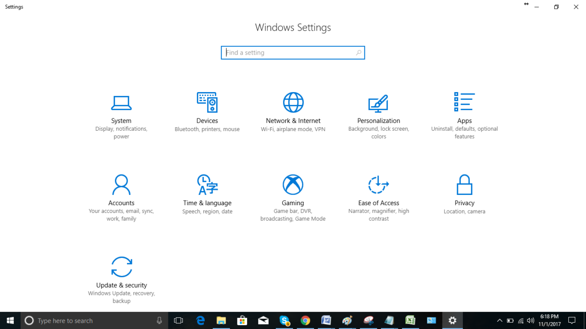
Central to this is the removal of almost all colors, the use of text labels over icons where possible (though simple monochrome icons are okay) and only rectangles with no decorations. This also meant no folder-centric model for settings but rather all the items put into a text-based menu on the left-hand side and an endless scroll-of-doom on the right side containing sparsely distributed settings.
This led to the absolutely beautifully dystopian Settings app as it exists in Windows 10:
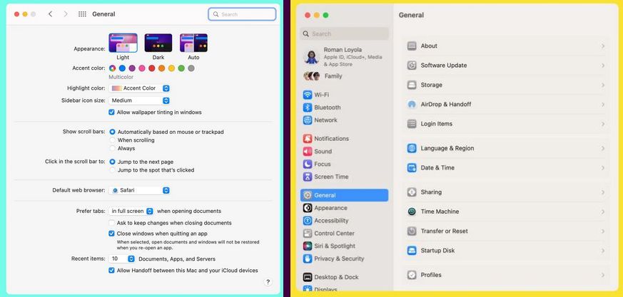
All of this came as skeuomorphic designs were suddenly considered ‘passé’, and the new hotness was so-called Flat Design. Google’s Material Design as developed in 2014 is another good example of this, with the characteristic ‘flat UI elements adrift in a void’ aesthetic that has now been adopted by Microsoft, and a few years ago by Apple as well starting in 2022 with MacOS Ventura’s System Settings (replacing System Preferences).
Rather than a tabbed interface to provide a clear overview, everything is now a blind hierarchy of menu items to scroll through and activate to access sub-, sub-sub-, and sub-sub-sub- items, and inevitably realize a few times that you’re in the wrong section. But rather than being able to click that other, correct tab, you now get to navigate back multiple views, one click at a time.
It isn’t just Windows and Apple either, but many of the big desktop environments like Gnome have also moved to this Flat Design Language. While various reasons have been provided for these changes, it’s undeniable that FDL makes a UI less intuitive (because there’s less useful visual information) and makes for a worse user experience (UX) with worse ergonomics as a result (because of the extra scrolling and clicking). This is especially obvious in the ‘independent applets’ versus ‘monolithic settings app’ comparison.
One-Track Mind
Imagine that you’re trying out a couple new wallpapers in Windows while keeping an eye on Windows Update’s latest shenanigans. You then need to quickly adjust the default audio device or another small adjustment unrelated to any of these other tasks. If you are using Windows 7 or earlier with the Control Panel applets, this is normal behavior and exceedingly common especially during hardware troubleshooting sessions.
If you’re using the Settings app, this is impossible, as only view can be active at a given time. You think you’re smart and right-click the desktop for ‘Personalize desktop’ so that the other Settings view stays intact? This is not how it works, as the Settings app is monolithic and now shifts to the newly selected view. Currently this is not too noticeable yet as many applets still exist in Windows 10 and 11, but as more and more of these are assimilated into the Settings app, such events will become more and more common.
It would seem that after decades of UI and UX evolution, we have now reached a definite point where UX is only getting worse, arguably around the release of Windows 8. With color banished, anything even remotely pseudo-3D frowned upon and UIs based around touch interfaces, there will soon be no difference between using a desktop PC, tablet or smartphone. Just in the worst way possible, as nobody has ever written about the amazing ergonomics and efficient UX of the latter two devices.
Perhaps our only hope may lie with the OSes and desktop environments that keep things real and stick to decades of proven UX design rather than give into Fad Driven Development.
Rest in peace, Windows Control Panel. We hope to see you again soon in ReactOS.